The Ultimate Guide to Effective Progress Indicators in Web Applications
Key Takeaways
- Progress indicators enhance user experience by providing feedback during wait times.
- Choosing the appropriate type of progress indicator depends on the task's nature and duration.
- Implementing best practices in progress indicator design can reduce user frustration and drop-offs.
Table of Contents
- Importance of Progress Indicators
- Types of Progress Indicators
- Best Practices in Designing Progress Indicators
- Common Mistakes to Avoid
- Real-World Examples
- Conclusion
Importance of Progress Indicators
Instant feedback has become the gold standard for digital experiences, particularly in web applications where seamless interactions are expected. Despite performance improvements, many processes still require a wait due to data fetching, computations, or uploads. Users need reassurance during such times; a well-designed progress indicator UI becomes indispensable. A visible indicator ensures users do not perceive your application as frozen or unresponsive.
Effective progress indicators build trust and confidence in your application by showing users that their action is being processed. The psychological impact of anticipation and feedback is profound. Research consistently shows that when users are kept informed, their tolerance for wait times greatly increases. When this communication is absent, frustration rises, and abandonment rates soar.
Furthermore, well-timed progress feedback can also preempt common support requests. When users understand how long a task will take, or are reassured that the application is still at work, they are much less likely to seek unnecessary assistance or attempt to repeat their action, potentially causing errors or data conflicts.
Not only do progress indicators help users manage expectations, but they also contribute to overall satisfaction levels. Incorporating these UI elements has even been shown to enhance the perceived quality and professionalism of a platform, boosting the likelihood of continued engagement. For deeper insights into user interface best practices, well-established resources such as Smashing Magazine's guide on progress indicators offer detailed advice for designers and developers.
Types of Progress Indicators
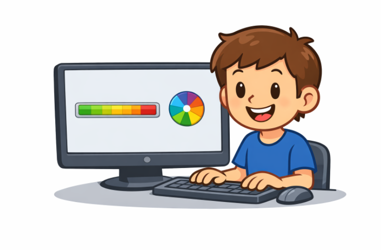
Progress indicators come in two primary forms: determinate and indeterminate. Choosing the ideal form depends mainly on whether the system can calculate the amount of work remaining in a given task.
- Determinant Indicators: These clearly show the exact progress of a task, usually expressed as a percentage or a bar that fills over time. They are best for tasks with a predictable end, such as file downloads, installations, or uploads. The user knows exactly how much work remains, which reduces uncertainty.
- Indeterminate Indicators: Most useful for activities where completion time cannot be accurately predicted. Examples include spinning wheels, pulsing bars, or animated dots. Their primary function is to communicate that the system is working, even if it is impossible to indicate a precise timeline.
Consider the task type and the available information when implementing a progress indicator. Whenever possible, determinate indicators are preferable due to the certainty they provide. However, for background processes with unpredictable timing, indeterminate indicators are the best choice.
It is important to note that progress indicators should be accompanied by clear, concise messaging whenever practical. Labels such as "Saving changes..." or "Uploading file, please wait" can make these indicators even more effective. More guidance can be found in large resources such as Smashing Magazine's guide on progress indicators.
Best Practices in Designing Progress Indicators
Designing progress indicators that genuinely improve the user experience requires a thoughtful approach. Here are critical best practices:
- Provide Accurate Feedback: The indicator should accurately reflect the task's state. Misleading information, especially on determinate indicators, can quickly erode user trust if the progress bar "hangs" at 99% for too long.
- Use Appropriate Visuals: The style of your indicator should harmonize with your application’s overall aesthetic. Avoid jarring or out-of-place visuals.
- Maintain Consistency: Users should not have to guess where to look for progress. Indicators should appear in the same place, be similarly styled, and function uniformly across your platform.
- Optimize Performance: Progress indicators are a support tool, not a burden. Their animations and scripts must be lightweight to avoid further delays in your application’s responsiveness.
Enabling users to cancel or pause long-running tasks through the indicator increases usability and gives users a greater sense of control.
Employing micro-interactions and smooth animations can make the waiting experience noticeably more pleasant. However, excessive movement can be distracting, so moderation is advised.
Common Mistakes to Avoid
Despite the seemingly simple nature of progress indicators, mistakes are common and can be detrimental. Here are some pitfalls to avoid:
- Providing No Feedback: Users should never be left guessing if their action is being processed. This is one of the most significant sources of user dropout.
- Using Misleading Indicators: Indicators that exaggerate progress or stall near completion can create frustration and ultimately foster distrust in the application.
- Overloading with Information: Bombarding users with excessive detail, such as complex breakdowns for short tasks, is unnecessary and distracting. Keep information focused and relevant to the task.
Progress indicators should serve as a source of reassurance and guidance, not a source of confusion. Every detail should be carefully considered to keep the interaction as intuitive as possible.
Real-World Examples
In SaaS platforms where file uploads are a frequent user activity, such as cloud storage services, a determinate progress bar indicating exact upload percentage ensures users stay patient and avoid repeated uploads or unnecessary support contacts. For example, Google Drive’s file upload progress indicator updates users in real time, complete with estimated time remaining.
Conversely, when processing data or fetching search results, activities where duration fluctuates widely based on server load or data size, an indeterminate spinner is often favored. While the system cannot state exactly how long the wait will be, users still know that work is occurring, and the application is not locked up.
Many leading apps combine indicators with text instructions to clarify what is happening and, when possible, how long it will likely take.
Conclusion
Progress indicators are a fundamental aspect of modern digital experiences. They shape perceptions of speed and reliability, and when designed with the user in mind, can greatly boost satisfaction and trust in your platform. By understanding the different types, leveraging best practices, and avoiding common mistakes, web applications can deliver a polished, user-friendly experience that keeps users coming back.